Thursday, May 17, 2012

"Empty Spaces - New Growth"

Carol here.

In my last entry, I wrote of stitching several of the phrases "empty spaces" in a cream colored thread, which would reward the viewer that takes a closer look.
I really love the additional texture that added to this canvas!


I finished up the piece by transferring the enlarged & cropped lily onto the canvas. I used a graphite transfer paper to trace parts of the drawing onto the canvas, freehand drawing the remainder (I had drawn the image several times already in my sketchbook so I was very familiar with the lines of it).


You will recall in my previous post that I wanted to add a touch of red into this piece.
As chance would have it the Lily Leaf Beetle (sometimes called the Scarlet Lilly Beetle) is a pest to the Crown Imperial Lily.

I practiced drawing the beetle in my sketchbook.


Sometimes things just work in your favor, don't they?

So I added three of the red beetles, munching on the plant as they leave their own empty spaces.


I wanted to have one of the "Empty Spaces" phrases more prominent so I stitched the chosen one in red. I used a very light application of watercolor paint inside the letters.


The last thing I did to finish this piece up was to stretch the canvas over stretcher bars. I had planned on this finishing technique from the beginning so I was very careful about where the lily and the phrase was placed.

One of my favorite things about this piece was how the layering all came together in the end. I have many layers of text, transfers, stamping, collage, paint, molding paste, machine stitching and drawing on top of this canvas. 


When you view the entire piece, you can see peeks of each layer.


"Empty Spaces- New Growth"


I hope that you all allow the empty spaces in your life to fill with new growth.

Thank you for following along with me as I created this artwork.


Monday, May 14, 2012

Finished but Nameless

 
Liz Kettle posting. My piece for the Empty Spaces theme is finished. I decided to mount it on a canvas because the two parts of the diptych are small and I was worried that they would be lost when hung directly on a wall. Plus, it was important for me to have the space around and between the two pieces to be white which you can't always count on in a gallery setting.


Hopefully you can see some of the stitching in this detail photo. The left side of the diptych is stitched along the black lines in cotton thread. The right side is stitched in the white spaces with silk and rayon threads. I hope this piece evokes the question of what is 'empty'.


I haven't decided on a name yet. Usually, when I hand stitch so much on a piece of art I have plenty of time to mull over a name but this time I didn't come up with one. I will have to make a list of ideas and see what resonates. Let me know what you think in the comments.

Thursday, May 10, 2012

The evolution of "Faith" - my empty spaces piece

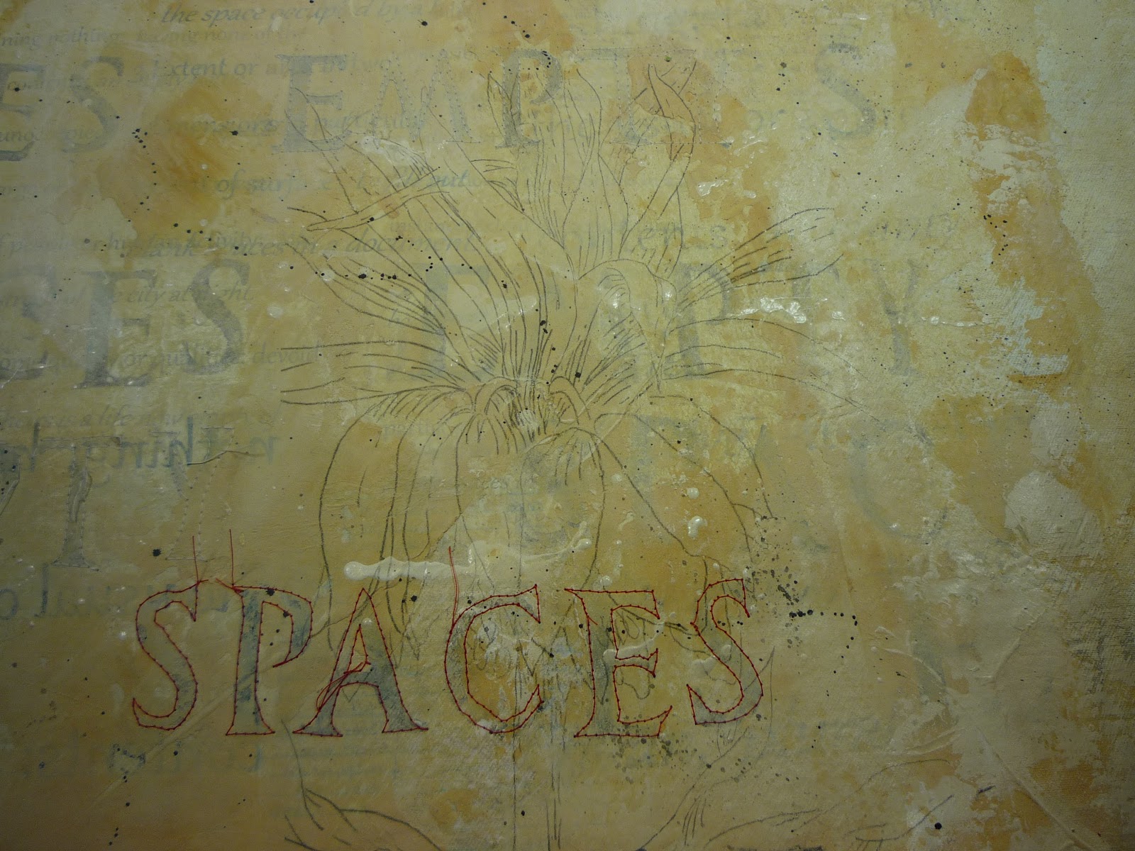
Gloria Hansen here. In thinking about "empty spaces," my mind was jumping to many interpretations,  and I quickly realized it's a theme that we all can explore for a very long time. To quiet my jumping thoughts, I decided to keep it simple, keep it simple, keep it simple, and see what flows.  This is how my piece empty spaces piece evolved:

 I started with an empty box and added a red square.  Working digitally, I created a line of progressively larger dots. I envisioned french knots, with the larger knots having an extra wrap of thread.
In this version, I added lines of digital stitches.  Another way to think of it is a line with "empty spaces."

I added black to further break up the empty space, and added more lines of vertical digital stitches.

I turned off the digital layer with the stitches and started to experiment with the shape of the black rectangle.

I added perspective and then experimented again with digital stitches.
Still clueless as to what would evolve, those shapes immediately reminded me of a show I saw in London at the Museum of Design. There was an exhibit by John Pawson, an architect who is described as a "minimalist" and is known for his process of reduction and for creating designs of "simplicity, grace, and visual clarity." The image above on the left was central to the exhibit, a "site-specific 1:1 full-size installation." I'm standing within the room in the image on the right.  I and my business partner, Derry, who took me to the exhibit, spent a lot of time sitting on the bench and absorbing the incredible peaceful feel of the space. Although we were sitting in the middle of a busy museum, it felt more like we were sitting within a zen garden.

Also of interest, on the other side of the back wall are people looking at a different piece in the exhibit.  While anyone within the room could see those behind the room, those outside could not see in. More food for contemplation.

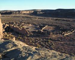
As I thought more about that exhibit, I started going through folders of photographs I'd taken around that time period. In the process, I started pulling out copies of ones I might want to work with. After weeding them down, I decided on two below to form the basis of my piece -- an open road that I took from the front passenger seat while traveling out west and a photo of a window from a decaying building in England.


I selected more photos with things that can move through space -- a bird, a sheep, a train, a flying machine, and I selected an escalator and a statute. The escalator was taken inside a science museum, and I loved the neon colors reflected on it. Two photos that comes up a lot in my personal work are a replica of daVinci's flying machine that was on display at the V&A Museum and a Paris-bound train with daVinci artwork on it (although I've added to the image above). The flying machine is in two pieces I've made: The Journey and Another Journey, and the train image is in a piece not on my website yet.

I opened all of the images in Photoshop and began working with them. Night after night, more nights after night, I worked on the design. Version after version, layer after layer.

This is one of the versions I came up with.

As you can see, the above has a lot of layers, groups, and groups within groups of layers going on. My next goal was turning off layers to see what I could remove. 

 
While experimenting with various versions, I added a black/white adjustment layer to remove color altogether. By dragging the color sliders, I experimented with the tonality of the image. Using a black/white adjustment layer is a better option than simply desaturating an image as you can control the value of the lightness and darkness of each color within your image. 

Because the size requirement is based on 8, I experimented with different scales on the elements within the design. 

While I like this, it seemed to also need some type of framework.


The above is the final piece called "Faith" which is left for you to interpret however you wish.  While the image is bordered in gray, I suspect there will be no binding or border on it, but rather a facing.  My intent is to print it on silk and hand stitch it.  Because I have several versions of it, in color and without, I also hope that it is the first in a series.

I often find the path to a new work is an interesting one, and I hope you've enjoyed the thinking behind this piece.


Friday, April 27, 2012

Empty Spaces - "What We Keep"

Jamie Fingal here. My piece is all about loss, and the things that we keep, to remind us who we are.  There is more in a previous post, and you can view it here.

The fabrics were Mistyfused to wool blended felt, free motion machine quilted, and a bit of hand sewing with #8 Perle cotton threads

A vintage zipper, and a photograph of scissors from my mother's sewing desk.  The photo has been transferred to fabric, with an ink jet copier.  The background of the scissors was painted to enhance the colors of the scissors.

Full view; with a photo transfer of my mom's cookbooks, apron, recipe holder, etc., on the upper left - scissors on the right.  Title:  "What We Keep: to remind ourselves who we are" by Jamie Fingal 2012  - 16" x 16"

Thursday, April 26, 2012

the empty space between

Sue B here...

In my last post here I talked about I had worked myself into a creative block over creating a piece for the "empty spaces" theme.   I really thought I was going to represent the theme with a vessel of some sort but I just couldn't seem to find the right shape for it.  It was after walking away from the project for a couple of weeks and coming back to it that the "aha" moment hit me and this piece came out of that moment:

 "empty spaces" 
hand painted silk, hand dyed black cotton, mounted on stretcher frame 12" x 24"

It's the empty spaces in this piece that create the imagery.  Without those empty spaces it would just be a solid piece of fabric.   Sometimes, in art, just like in life, it's the empty spaces that have the most impact.


"empty spaces" detail


Tuesday, April 24, 2012

In the Shadows

Kathyanne here--When I started my Empty Spaces piece I worked on it for awhile and it was getting pretty dense so I did what I do a lot with my art.  I took that piece another way and it no longer fit the theme we had decided on.

Now what?  Since I had been playing with tiny digital pieces cut from digital prints on wire mesh I was fascinated with all the open space, the shadows and depth the assembled pieces created when combined with wire and mesh.  Turning my ideas into pages I used elements from one of my unfinished pieces and started to put pieces together. 

I had no plan on where this was going, so I worked through it without photo documentation and just worked it out a bit at a time.

Materials included- digital print on metal mesh, digital print on wood veneer, copper wire, crocheted brass wire, brass mesh, aluminum mesh, waxed linen, hardware cloth, black and white beads and assorted colored metal wire.

Here is a shot of the whole piece and a couple of the pages.


Monday, April 23, 2012

"Chaco Canyon: A Topography of Loss"

Leslie here.  I took an unusual path to create my piece for our "Empty Spaces" exhibition.  Although I love hand-stitching I simply don't create many pieces using embroidery.  My love of hand-stitching was re-ignited in March when I was fortunate to have a one-day workshop with the amazing Mary Ruth Smith.

This piece is a good example of how interesting it can be to allow oneself to work intuitively:  I really had no idea where this was going when I started.  I worked with these shapes, free-cutting the cloth into what turned out to resemble topographical contours.


 The more I looked at the piece as it took form the more I felt it looked like a desert landscape.  Halfway into it I realized I was thinking a great deal about my late sister Priscilla, who passed away in March of 2001.  Interestingly (and I doubt this was a coincidence) I began working on this on the anniversary of her death.  These anniversaries have a way of bringing forth memories; I've learned to honor them.

My sister lived for many years in New Mexico and developed a deep love for the culture and landscape, especially the indigenous peoples of the area.  She immersed herself in the history of the area, particularly the ruins of Chaco Canyon.


When I look at images of the ruins of this place in the high desert I wonder how it became the center of such a thriving culture:  it had a long winter, short growing season, and scant rainfall.

I am captivated by the juxtaposition of the man-made contours of the ruin to the vast emptiness of the landscape.


My sister chose to have part of her ashes scattered in this beautiful place so it has taken on an honored place in my heart.

To finish, I elected to use a facing method for the edges.  I will later stretch this piece onto a frame, and this facing technique works well in conjunction with that and gives the piece a very nice finished edge.  Using white background is highly unusual for me, but somehow it works in this piece.


Once the facing was stitched I clipped the corners and turned the facing.  I had previously fused the facing pieces, so they will adhere nicely to the back of the construction.
I admit that I have not decided which way I prefer to have the piece oriented.
What do you think?


Here are a few details.


Thanks for reading about my journey making this piece.