I was thinking about critique the other night. The art center I belong to has a monthly crit group and I decided I should participate. But what to bring?
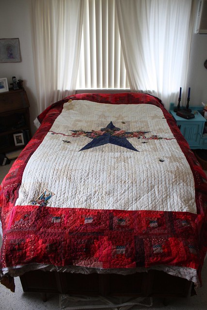
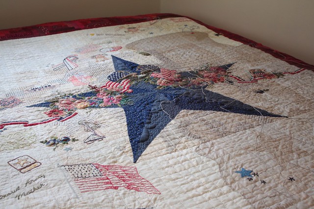
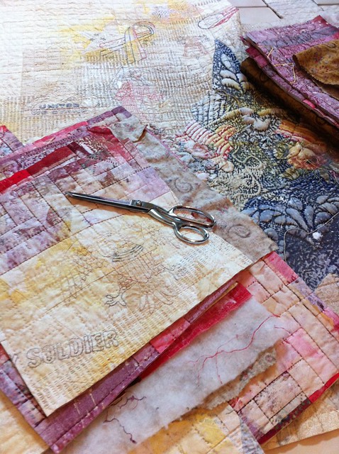
I am working on a large quilt for my Security Blanket series. I hesitate to bring it for several reasons. The first is because I am adding some appliquéd shapes and I don't want them to get crumpled or misplaced in transit. The second and more important reason is that I feel like this piece is far enough along that I am committed to it for good or bad. There is no turning back. I'm not proud or happy that I feel that way about this piece (I recognize that it's not a position of growth), but I do.
I could bring a few drawings from the life drawing sessions I attend. But those are never really meant to be finished artworks, just exercises, so what would the point be? Of course, I could probably get some insight on avenues to explore in future drawing sessions, so maybe I should bring my sketches one of these days.
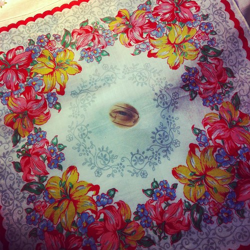
I decided to bring a collection of hankies I am altering for my Army Wife series. I feel pretty solid about the basic premise, but I'm not sure how best to present them. The crit group could help me with that, and the hankies are not so far along that if there was input that could potentially change other aspects I wouldn't be able to implement it. The other artists at the session did indeed have some great ideas about how to present this work, and confirmed that I was on the right track. Next month I promise myself that I'll bring something meatier to crit!
All this agonizing over what to bring reminded me of a conversation I had with a friend a while ago about critiques and Show and Tell in general. It is often difficult to share work in a forum where people might question it. That questioning is often taken personally. My answer to my friend's query how I dealt with criticism was that art school taught me to develop a thick skin, not take it so personally, and to take what was helpful and ignore the rest. She asked what our art school critique sessions were like.
To tell the truth, I can't remember. I remember the lessons I took away from them, but I don't remember the format or my feelings at the time. I think it was pretty simple. Put your work up on the wall (everyone's at once if I remember correctly), and then one by one we explained what it meant. These were design classes for the most part, so there was usually a list of "client" needs we were to have addressed. Then the instructor and students talked about what in each work addressed those needs and what wasn't so effective. There were what-if questions too about color and compositional choices and type faces and the like. I don't remember ever being completely crushed by anyone's comments. Disappointed maybe, but never crushed. And there was almost always something that could be changed or applied to the next assignment. Maybe it was because we were all relatively equal -- similar ages, at the same place in school, all good enough to have been accepted into the school in the first place, etc. Maybe quilt guilds and art quilt groups are too varied in experiences to be comfortable places for hearing opinions (and it is all subjective opinion) on one's work.
As uncomfortable as they can be, I think critiques are important for growth. I think they can be effective even if it's as simple as a group of friends one is comfortable with, or if it's a more formal setting. And let's not forget the self critique. Is my work good enough? Am I relevant? What can I change to make the work better? Eternal questions, I know. But critique can help me find an answer, at least temporarily.
Tuesday, November 25, 2014
Tuesday, October 28, 2014
Heading to Houston
I'm heading off to Houston tomorrow for the annual Quilt Festival.
I have mixed feelings about where I belong in this show.
It is predominantly a traditional quilt show, and the majority of attendees appear to be looking for quilts recognizable for use on a bed, and they're looking for fabrics, threads, patterns, and gadgets that they may not have seen at their local quilt shops. That's not to say that art quilts are not represented. SAQA always has a large exhibit space and at least one more special exhibit has art quilts for inspiration. But it's a quilt show, and that's very different than a museum or gallery show. That's not a bad thing, it's just that as I personally see my work fitting in to more of the latter, I wonder why I'm so attracted to the former.
As I move beyond just looking at the exhibits to hoping to have work in them, or maybe even to finding other textile-related ways to share my talents, I see many of my peers gravitating less towards the Festival, but to the Quilt Market where new fabrics and other products are introduced to shop owners and the like. It seems more and more to me that's where the real networking and opportunities happen. But I don't think it's where networking for textile art exhibits like I imagine for my work happens.
So what am I looking forward to this weekend? Inspiration! I love a good quilt. I love to see what people do with fabric. This year I have a quilt in the annual Dinner@8 exhibit. That's reason enough to go, as I like to see my work "in situ." I thoroughly enjoyed the year the Twelve by Twelve group I belonged to had an exhibit (photo above). It was great to see our work together and it was fantastic to get to know these internet friends in real life! I'm looking forward to the socializing. I get to spend time with a good friend and experience the show with her. I also enjoy meeting other enthusiasts who I may only know from our mutual blog reading or work admired in other shows. Shows like this one in Houston are also a good chance to volunteer for the organizations we benefit from. I always spend some time at the SAQA table where I not only get to meet other SAQA members, but I get to share it's benefits with potential new members or simply those who admire the variety in SAQA's exhibits.
Even though a quilt show may not be the best venue for my own work, I hope to return energized about textiles in general. And I hope to have made some new connections because you never know what might lead to something interesting.
Sunday, October 19, 2014
Experiments in Minimalism
I just finished up a class in Minimalism/Reductive art. It is quite fascinating and much more difficult than it looks. You can find minimalism in all forms of art expression from traditional painting to contemporary film, video and music.
Minimalism began as a reaction to abstract expressionism. Basically a bunch of artists got together and wrote out the manifesto or rule book for Minimalism. These artists, Donald Judd, Dan Flavin and Sol LeWitt among others decided that they wanted to create an art movement that embraced an absence of expression and create art that was objective, non-referential, and kept the hand of the artist to an absolute minimum.
The characteristics of Minimalism include:
1. Simplicity of form
2. use of monochromatic palette or primary colors
3. an emphasis on pure shape
4. removal of any appearance of composition
5. keeping true to the materials and often employing industrial materials or mass produced supplies rather than 'art' materials.
We had lots of great discussion in class if true Minimalist art is even possible to achieve. We all worked hard to question where the fine line was between abstract and minimalism. At what point was there that one thing too much. Everyone in the class produced great work from a variety of mediums including a couple videos. We all felt that the most difficult part was to create something minimalist while avoiding boring!
If you would like to learn more there is a great abstract on Minimalism here.
I have a lot more ideas for exploring minimalism in stitch. Do you like it? Hate it? Want to try it? Let me know.
"A shape, a volume, a color, a surface is something itself. It shouldn't be concealed as part of a fairly different whole."
Donald Judd
5 Red Squares by Liz Kettle
Minimalism began as a reaction to abstract expressionism. Basically a bunch of artists got together and wrote out the manifesto or rule book for Minimalism. These artists, Donald Judd, Dan Flavin and Sol LeWitt among others decided that they wanted to create an art movement that embraced an absence of expression and create art that was objective, non-referential, and kept the hand of the artist to an absolute minimum.
The characteristics of Minimalism include:
1. Simplicity of form
2. use of monochromatic palette or primary colors
3. an emphasis on pure shape
4. removal of any appearance of composition
5. keeping true to the materials and often employing industrial materials or mass produced supplies rather than 'art' materials.
If you would like to learn more there is a great abstract on Minimalism here.
I have a lot more ideas for exploring minimalism in stitch. Do you like it? Hate it? Want to try it? Let me know.
"A shape, a volume, a color, a surface is something itself. It shouldn't be concealed as part of a fairly different whole."
Donald Judd
Thursday, September 4, 2014
Small Wonders
Our Exhibit is ready to be seen! Please join us for the opening reception on Sunday, September 7th from 1 to 4PM at the Etui Fiber Art Gallery in Larchmont, NY.
Here's the official invitation:
Diminutive bugs and birds, petite scale, delicate details of line and stitch – all in tiny treasures on view at Etui Gallery during the month of September, 2014. Eight artists brought together by a love of fabric and stitch show off their varied approaches to mixed media textiles in this exhibit of small works. Layers of machine and hand stitching intimately render buildings and homes both in Natalya Aikens’ works, which incorporate recycled ephemera, and in Kristin La Flamme’s fabric collages. Benedicte Caneill’s work incorporates impeccably sewn pieces of her monoprinted fabrics to create dancing compositions of color and line. Jane Davila and Gloria Hansen turn their focus on small-scale flora and fauna with an eye to graphic simplicity and macro photography respectively. Carol Sloan, Liz Kettle, and Beryl Taylor round out the collection with tantalizing layers of intriguing fabrics, delicate paper, painted textures, wee stitches, and tiny details that draw the viewer in for a closer look.
Here are a few photos to entice you to come see them in person!
Front facing wall with art by Jane, Benedicte and Gloria |
Small wonders by Kristin |
Corner view with work by Gloria, Benedicte, Liz and Natalya |
Gloria's butterflies |
Benedicte and Liz's work |
Main wall with work by Liz, Natalya, Carol, Beryl and Kristin |
A restful spot with work by Kristin, Natalya and Carol |
Monday, September 1, 2014
Beryl here, well it seems such a while since I posted last, been traveling !
At the moment I am doing some new work with stencils. I'm working with stenciling on sheers mainly silk organza which has been dyed,layering stencils on the top and spreading modeling paste with a spatula over the stencil and leaving to dry. When dry I either machine or hand stitch around image. These small pieces are part of a much larger piece which has yet to be assembled.
Monday, August 25, 2014
Portfolios
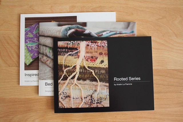
A picture is worth a thousand words, right? Smart phones and tablets have made it much easier for us fiber artists and art quilters to show people what it is that we create, rather than relying on imaginations that too quickly jump to underwater basket weaving and grandma's feed-sack quilts. I have photos of my work on my phone and am all too happy to pull up a picture when anyone shows any amount of curiosity. But my phone is small. So, I've taken to bringing along portfolio books whenever I think I might be in a situation where someone might want to see my work.
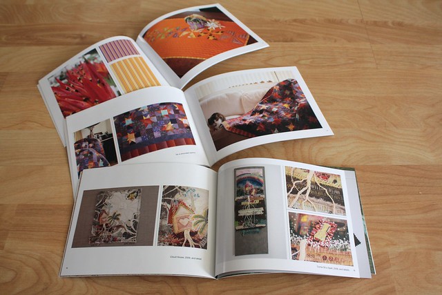
One of the best things about these books is that I can make one for each series of my work, or the different facets of my work. I don't have to worry about confusing my fabric collages with my bed quilts. I can choose to show one portfolio or the other, depending on the audience. My dad complained yesterday that he has to scroll through my blog to show his friends my work when they come to visit, so today I made a brag book that has all my recent work.
There are many ways to create these books. I have a Mac computer and it's set so that all my photos download directly into iPhoto. So, I've found it very easy to choose one of iPhoto's project templates, plug in the photos, write descriptions, upload it all to Apple, and expect a shiny book to arrive at my door in about a week. Other online printers and photo services also have similar templates, or you can design your own solution from scratch. The books that I order from Apple are best in small quantities, but I really like the elegant template, quality printing and absolute ease of creation.
Last week I was in Oregon and attended a reception at a gallery where one of my Army Wife aprons was part of a group show. I shared my Army Wife portfolio with the curator, and she asked if the gallery could keep the portfolio for the duration of the show. Of course! It will be a great ambassador for my series. I also showed two other portfolios at lunch during a quilt show in Portland as everyone sitting at our table was introducing themselves and describing what each of us does. Handy portfolios are now as much a part of my art business as my business cards are.
Saturday, August 16, 2014
The Art of Fine Craft
Liz here today. Anyone else wondering where the summer went? I wanted to sit in the sun this morning with my coffee and a good read so I picked up the June/July 2014 issue of American Craft. In it discovered a great article titled Hot Glue & Staples by Bruce Metcalf. He questions whether craftsmanship even matters to the contemporary art world. Mr Metcalf and I both agree that it should!
Mr. Metcalf gives us 4 standards to which we can look at art (our own or others) to help us determine which is art and which is not.
The first is that good art demands careful thinking. Metcalf holds that clear, interesting ideas and a compelling concept are key to good art. Bad ideas abound and they result in bad art. "Good concepts require careful work. In other words, there is a craft to thinking, a way of thinking carefully, as opposed to being sloppy and stupid".
Second, 'The artist must know his field'. I see so many examples of failure in this arena in the mixed media world. Someone who knows her field is so often copied by those who don't know the materials, techniques and tools. They create something that on the surface is similar but doesn't have the soul of the first artist. Then they run out to teach it. This makes me crazy! The unwitting student doesn't get the real meat of the field and is left not knowing much more than how to copy. I won't get on my soapbox even though it is tempting...
The third standard is that 'the artist must be able to translate the idea into a visual experience'. Art is and always has been about communication. This is where the artist must continually circle back to the concept from the first standard and work through their knowledge of the second standard to determine how to express the essence of their idea. Does the form they envision communicate the idea clearly, uniquely, and in a compelling way? I think this is often done intuitively as the artist goes through this dance back and forth through concept/idea and material constraints instinctively.
Fourth, 'the last component is exercising control over composition'. How do you arrange the elements of the idea, remove or add distractions to make something interesting without losing the concept or idea of the art? While the basic principals of design and composition may seem so old school, you can't make great art without understanding them.
I agree with these 4 standards. I have never written down my process but it follows these 4 standards pretty closely. Generally I spend more time in the thinking stages because they guide the production stages. Of course the many years I spent learning my field and time spent studying in other fields to add in what is useful to me, help make the execution stage fairly straight forward and often relatively easy. Not that I don't struggle with parts and nothing ever gets birthed without going through an extended ugly stage!
What do you think of Mr Metcalf's 4 standards? Does it resonate or leave a sour taste in your mouth? Leave me a comment below.
You can read more about Bruce Metcalf and see his beautiful jewelry on his blog and website.
Mr. Metcalf gives us 4 standards to which we can look at art (our own or others) to help us determine which is art and which is not.
Al B thinking about the next step
The first is that good art demands careful thinking. Metcalf holds that clear, interesting ideas and a compelling concept are key to good art. Bad ideas abound and they result in bad art. "Good concepts require careful work. In other words, there is a craft to thinking, a way of thinking carefully, as opposed to being sloppy and stupid".
Second, 'The artist must know his field'. I see so many examples of failure in this arena in the mixed media world. Someone who knows her field is so often copied by those who don't know the materials, techniques and tools. They create something that on the surface is similar but doesn't have the soul of the first artist. Then they run out to teach it. This makes me crazy! The unwitting student doesn't get the real meat of the field and is left not knowing much more than how to copy. I won't get on my soapbox even though it is tempting...
The third standard is that 'the artist must be able to translate the idea into a visual experience'. Art is and always has been about communication. This is where the artist must continually circle back to the concept from the first standard and work through their knowledge of the second standard to determine how to express the essence of their idea. Does the form they envision communicate the idea clearly, uniquely, and in a compelling way? I think this is often done intuitively as the artist goes through this dance back and forth through concept/idea and material constraints instinctively.
Fourth, 'the last component is exercising control over composition'. How do you arrange the elements of the idea, remove or add distractions to make something interesting without losing the concept or idea of the art? While the basic principals of design and composition may seem so old school, you can't make great art without understanding them.
What do you think of Mr Metcalf's 4 standards? Does it resonate or leave a sour taste in your mouth? Leave me a comment below.
You can read more about Bruce Metcalf and see his beautiful jewelry on his blog and website.
Sunday, July 20, 2014
Pushing Boundaries
Pushing Boundaries
I have just passed the one year anniversary of my move
to a professional studio space so of course I am thinking about what has happened
over the past year.
First of all, I absolutely love having my studio in a busy
arts center. I do get interruptions occasionally but I also get amazing inspiration, support
and encouragement. I have learned so much about art and the creative process by
hanging out with a wide variety of artists including oil and acrylic painters,
photographers, jewelers, potters and even a few knitters.
One of the biggest growth opportunities this last year is because Cottonwood Center for the Arts hosts themed exhibits 6-8 times
a year. Each exhibit challenges me to learn more about art history and theory.
I try to enter as many as possible and even though I don’t always get in the
show I learn so much that it really doesn’t matter. I was more than thrilled to
be accepted into the abstract and postmodern exhibits this spring.
This piece, Does it Matter? was accepted into the Postmodern show. I and many of the other artists at Cottonwood spent considerable time discussing exactly what is Postmodern art. It is still confusing but I was thrilled to have one of my pieces get in. Competition for these exhibits is pretty intense. During the show I had quite a few great conversations with viewers about my piece and the question it asks. Great fun. I didn't have good photo lighting for this piece. The background is flat black like a chalkboard.
As you can see my work is changing! I still love collage but am moving away from it to a more abstract expression. I have been working very small; 4" square and 8" square but I just ordered a canvas that is 2' x 8' for a whole cloth piece I have been working on. Being part of a thriving art center has encouraged me to push at the boundaries of my textile art. I can't wait to see where I go next!
Friday, July 4, 2014
swooning..
Have you heard of the artist named Swoon? She is not to be missed. Natalya here to tell you about Swoon's exhibit at the Brooklyn Museum. It was a spur of a moment visit, I only had my iPhone to take pictures with and I took a gazillion. No worries, it was painful, but I edited them down to just a few...
You do have until August 24th to go see this for yourself, but in case that doesn't fit into your summer schedule, here's a brief review and many links. Caledonia Dance Curry is quite an accomplished artist who started with traditional training (she attended my Alma Mater Pratt Institute), but after graduating was very discouraged with the gallery system and became a street artist. She has managed to fashion an amazing career from that start and is now an artist with exhibits all over the world. She known for her installations and this is her latest at the Brooklyn Museum.
I had never seen her installations before, just have heard about her and seen a bit about her in a documentary film Our City Dreams. Needless to say that I was completely overwhelmed by what I saw and I'm sure Kristin can confirm that my jaw was on the ground. The scale of this installation is immense and cannot be expressed in these photos. Do see the videos in the links above to get a sense of the scale.
Hope you do get to see this exhibit, it's worth the trip! And happy Independence Day USA!
You do have until August 24th to go see this for yourself, but in case that doesn't fit into your summer schedule, here's a brief review and many links. Caledonia Dance Curry is quite an accomplished artist who started with traditional training (she attended my Alma Mater Pratt Institute), but after graduating was very discouraged with the gallery system and became a street artist. She has managed to fashion an amazing career from that start and is now an artist with exhibits all over the world. She known for her installations and this is her latest at the Brooklyn Museum.
I had never seen her installations before, just have heard about her and seen a bit about her in a documentary film Our City Dreams. Needless to say that I was completely overwhelmed by what I saw and I'm sure Kristin can confirm that my jaw was on the ground. The scale of this installation is immense and cannot be expressed in these photos. Do see the videos in the links above to get a sense of the scale.
plastic drop cloth (my heart fluttered). Swoon used the drop cloths that protected the walls during the installation in the installation. |
gigantic tree draped in cloth and lacy cut outs for leaves is at the center and made for very dramatic shadows |
cardboard tubes in a beehive like hut |
a collage of larger than life prints of her beautiful drawings |
delicate cut outs are draped on the floor where they curve and produce wonderful shadows |
here are the tree roots, so you can see the fabric |
more amazing drawings |
two large handmade boats are part of the installation (made from scraps), but I was fascinated by the lace sails and the shadows they made |
my kind of whimsical |
this is a top portion of one of the boats |
lacy cut outs cover many walls and backs of large figures |
Wednesday, June 25, 2014
Friends and Inspiration
It's Kristin again.
I have completed 11 painted and stitched canvases from the Service Star quilt in the previous post here! The curious can find them on my blog. I am happy to report that I feel no regret at painting and cutting up a decade's worth of work.
I am also happy to report that I had the opportunity to visit friend and fellow 8 That Create artist, Natalya, last weekend. We had a great time in NYC with two of three from a special circle of friends.
We spent the better part of two days together seeing art and soaking it in. This is our posse on Broadway, posting on one of Chakaia Booker's Rubber Sentinels.
One of my favorite exhibits (Natalya will post about the other, was The Urban Fabric, by Liz Kueneke at The Hudson Guild.
Kueneke embroidered city maps on fabric and then invited the city’s inhabitants to stitch on the maps in response to several questions, such as “what is the heart of the city?” and “what is a negative place in the city.” The embroideries were accompanied by legends explaining the symbols used, and photos and videos of participants telling their stories. The large scale made it relatively easy to "read" the maps, but it also allows the viewer to walk through them and therefore feel more connected to the city and the project.
The embroidered maps themselves are meticulous and attractive, and create a neutral backdrop for the rougher participant additions. It was interesting to see that in some cities, the loves, hates, and interesting bits were scattered overall, and in other cities, they were clustered in specific spots. The maps are beautiful in and of themselves, but the viewers’ responses on them add a wonderful depth.
Even the backs of the embroideries are intriguing.
I'm so glad we took the time to seek out this exhibit. I found the work to be well conceived and beautiful. It was all thought provoking and excellent fodder for further conversations and curiosity.
Of course, it didn't hurt that I was there with friends who were also inspired, and that our conversations veered into our own explorations and experiences and our own personal maps. We may work alone in our studios, but to also come together and commiserate with, encourage, and support each other is just as important to our work as the lone, introspective time. I am glad to have found such a group.
Tuesday, May 27, 2014
Drastic Measures
Kristin today.
One of the art lessons that has made a lasting impression with me was an experience my dad had when he was in art school. He told me that after laboriously drawing the day's model, the instructor had all the students erase their work, turn it upside down, and start again. The moral of the story is not to think that your work is ever too precious for improvement.
I have been working on this quilt on and (mostly off) for over a decade. The whole tale is on my blog today. It had changed in meaning for me, and I have tried to bring it up to date. After much laboring, I have come to the realization that it is just not working, and I have to take drastic, art school type, measures.
Sometimes (probably more often than we are willing to admit) there comes a point where something just can't be fixed and it has to be tossed or completely reimagined. I decided for the latter and painted my heirloom quilt and then cut it up. I plan to stitch some bolder designs over the panels and mount them on canvas as wall decor. It still may not work, but at least I will have been bold and tried; besides, it's not like the original project was going anywhere anyway.
Interestingly, I just read an article on Ragged Cloth Cafe this morning about creativity and fugitive artwork. It's worth checking out.
Friday, May 23, 2014
Articles on Making Stuff
Carol writing today.
A few months ago, I received word that two of the article proposals I had turned in to Interweave had been accepted for the newest Pages magazine.
Imagine my delight when I saw the publication for the first time and my artwork was on the cover!
I wrote an article about creating artful niches for miniature books.
It is a really fun project that is not that difficult to create.
The carving and painting portion is my favorite part! And, if you mess up, it's very easy to "erase" that area and start over.
I also wrote an article about creating a triptych out of canvas, plaster and molding paste.
Add a few lines from a poem, some of your favorite natural items and you have wonderfully textured piece to sit on a shelf or a desktop.
Pop over to this site and purchase your own copy of the Pages magazine.
This is the fifth edition and I have all of them. They really are chock full of wonderful projects.
A few months ago, I received word that two of the article proposals I had turned in to Interweave had been accepted for the newest Pages magazine.
Imagine my delight when I saw the publication for the first time and my artwork was on the cover!
I wrote an article about creating artful niches for miniature books.
It is a really fun project that is not that difficult to create.
The carving and painting portion is my favorite part! And, if you mess up, it's very easy to "erase" that area and start over.
I also wrote an article about creating a triptych out of canvas, plaster and molding paste.
Add a few lines from a poem, some of your favorite natural items and you have wonderfully textured piece to sit on a shelf or a desktop.
"Forest Symphony" |
The back side of "Forest Symphony" |
This is the fifth edition and I have all of them. They really are chock full of wonderful projects.
Friday, May 2, 2014
playing
With plastic in my case. Hi, Natalya here to declare that I have fallen into a deep dark hole that is called experimentation. What if I try this? What if I now do this? What if.......
You would think that after playing around with a material for a while, let's say a year, you run out of the "what if's". Not true in my case. At least not with the recycled plastic shopping bags. Or dryer sheets for that matter. Here are few detail shots of my recent experiments:
It's a good thing that there are some deadlines looming, as they make me finish my experiments and draw conclusions. But the experimenting goes on even with the deadlines, it's so much fun I can't help myself. I must find out what if.....
What are you experimenting with?
You would think that after playing around with a material for a while, let's say a year, you run out of the "what if's". Not true in my case. At least not with the recycled plastic shopping bags. Or dryer sheets for that matter. Here are few detail shots of my recent experiments:
layered with packing material batting, stitched and painted with acrylics |
dryer sheet painted with gesso |
plastic drop cloth, drawn on and stitched |
translucent plastics layered and machine stitched |
layered, stitched and sponge painted with acrylics |
What are you experimenting with?
Friday, April 18, 2014
Texture Inspiration Everywhere
Liz Kettle here today:
I have been on the road teaching and enjoying my newest grandson so I have been away from my studio a lot the last two months. When I am traveling I love to gather inspiration photos. And the photos I take most often are of textures.
Photos can be snapped while I am at the park playing with the grand-kids or walking in a new town. I am used to getting that look from strangers when I am taking close up photos of bricks or mulch.
I file these in a special texture photo file so when I am looking for lines, shapes or texture for stitch inspiration I can find it easily.
Today I am sharing an assortment of inspiration photos from my last two trips.
The first batch is from the playground:
Inspiring lines from shadows
I love the interplay of lines on the railings
I can see this done in free form stitching in shades of cream and brown or in wild colors!
The photos below are from the Elms hotel in Excelsior Springs MO where I taught for Art and Soul. Lines, swirls and textures...they all make me want to run to the machine.
What do you do to keep the inspiration flowing when you can't get into the studio?
I have been on the road teaching and enjoying my newest grandson so I have been away from my studio a lot the last two months. When I am traveling I love to gather inspiration photos. And the photos I take most often are of textures.
Photos can be snapped while I am at the park playing with the grand-kids or walking in a new town. I am used to getting that look from strangers when I am taking close up photos of bricks or mulch.
I file these in a special texture photo file so when I am looking for lines, shapes or texture for stitch inspiration I can find it easily.
Today I am sharing an assortment of inspiration photos from my last two trips.
The first batch is from the playground:
Inspiring lines from shadows
I love the interplay of lines on the railings
I can see this done in free form stitching in shades of cream and brown or in wild colors!
The photos below are from the Elms hotel in Excelsior Springs MO where I taught for Art and Soul. Lines, swirls and textures...they all make me want to run to the machine.
Who could resist all the beautiful lines on this antique cash register?
What do you do to keep the inspiration flowing when you can't get into the studio?
Subscribe to:
Posts (Atom)