Carol here.
In my last post, I talked about gathering the collage items that I felt I might use in the "Empty Spaces" group theme.
I was approaching the theme from this viewpoint or perspective -
I began to think about the theme as that kind of
empty space – the space left after the “usual or appropriate contents” were emptied.
With this seed of an idea germinating in my mind, I began to think of other
empty spaces. Spaces that existed for another purpose.
Like in the garden. You dig a hole (a space that is now empty) to drop a seed into it.
Or maybe in the forest. A tree falls to the ground, rots and eventually leaves an
empty space there. Yet, in that space, mushrooms begin to grow. Small plants sprout up.
The space is empty yet the death of one thing has provided a fertile space for another.
Life finds a way to fill that
empty space.
After thinking about the theme with those things in mind, I returned to the original thought – the empty spaces that loss can leave us with.
It doesn't have to be death, it could be the loss of respect, loss of love, loss of trust.
I spent a few days hiking in the forest right around this time. I had many hours of solitude to work through this thought process.
I wrote pages of notes while I was out there. Sitting there, surrounded by nature, hearing the rushing water of the nearby river helped to clarify my thoughts.
I only had a vague sense of what I wanted to do, I began by randomly moving papers around on my background.
But first - I want to share a piece of information about the way that I work. One that could help you as well.
When I first begin a new piece, I pull out enough raw material to make TWO pieces. I practice my ideas and layout on one and use the other as the "real" piece.
This gives me SO much freedom to try new things, to experiment with all those "what if's" that I listen to and allows me to screw up all I want while saving one piece to proceed with (most of the time ).
Oftentimes, my practice piece turns out to be my favorite one!
You should definitely try operating this way (especially on smaller pieces) if you are terrified to try new things or just want to experiment with listening to your intuition (instead of doing things the same old way or the "safe" way).
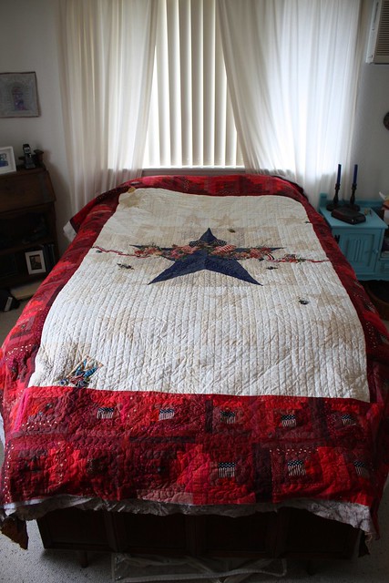
I decided on the finished size (16 inches x 16 inches) and added about three to four inches to this measurement so I'd have enough room to place the canvas onto stretcher bars when it was completed.
I used two different substrates since I wanted to experiment with the
Multi-Purpose Cloth. The other one was a piece of canvas (medium weight) that had a light to medium coat of gesso applied to it.
I used Golden's Soft Gel and Matte Medium as my adhesive and sealer.
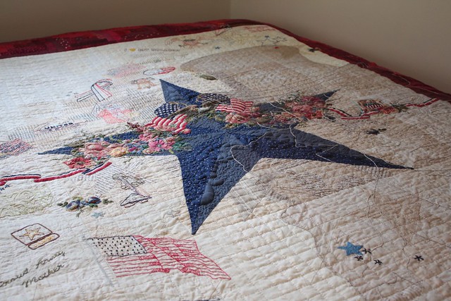
The first approach was to collage a bunch of different things onto the background- everything from handwritten notes to tissue paper.
And keep in mind that this layer is NOT about beauty. It's about embedding my thoughts, the physical evidence of those empty spaces left from personal loss or grief and about adding items that will deliver some texture in a subsequent layer.
Here's a look at how they started.
The photo above is of the base with
Multi-Purpose Cloth (MPC). It's much thicker than the canvas.
I lived with the background for a day or two before proceeding.
That's one thing about working intuitively - you have to spend time quietly listening to your inner voice. There are times that my voice screams at me (lol) to do things but other times she has me quietly looking and listening for what's next.
One thing was pretty clear to me though - the abundance of color on the MPC background had to go.
I felt any piece that was approaching the topic of "empty spaces" as a loss, as a space left after the “usual or appropriate contents” were emptied didn't need to be colorful...I felt that it needed to be very quiet, very soft and a noticeable
lack of color.
It needed to look the same way that space felt to me.
I decided to add a wash of acrylic paint over it.
I used a watered down fluid acrylic paint and spread it across the entire piece.
 |
paint+water=wash
|
I had several deadlines looming that were playing through my head. I believe that this fact combined with the addition of some physical pain that I was going through caused me to rush the process.
I tried to push the creation of this piece, which resulted in - you guessed it- a lot of (what I considered) mistakes or poor decisions.
That's one good thing about using acrylic paint and image transfer. You can cover things up or bury them so deeply into the background that no one will know what you did!
Well, except now you will know what I did...but it's all about learning and growing, right?
The wash helped to knock back the brightness but it still wasn't what I wanted.
I used an old credit card (my favorite paint mover) and scraped some watered down white paint across the surface.
I loved the way that the texture from the addition of the tissue paper and napkins took the paint!
I began working on the canvas right about this time. The time spent playing on the first piece taught me that I didn't want bold, loud colors for this canvas.
I was starting out with an empty space of canvas with a light coat of gesso on it
 |
| raw canvas on the left, canvas with gesso on the right |
I knew that I wanted to embed the definitions of certain words into the background. I wanted them to be partially hidden, elusive to the viewer and fairly transparent at this point.
I decided to use Matte Medium to transfer since it would be kinda grungy, transparent and I already had several things printed out.
I had forgotten to "flip" (or "mirror") the text before printing it. This would result in the text being backwards if I used it for transfer. I decided to go ahead and use it anyway since most of it would be covered up.
I cut out the text that I wanted to transfer, leaving a narrow strip around the edge so I would have something to grasp when I removed the paper. I also fold one corner back to make it even easier to begin that process of pulling the paper up.
Spread an even layer of matte medium on your substrate, not to thick but not too thin either. I would practice this a few times if you're just learning how before you do it on a "valued" piece of artwork. It certainly isn't a perfect transfer but I love the dreamy/airy look of it.
Burnish the area that you want transferred, making sure there is solid contact between the paper to be transferred and the substrate (canvas).
Since I used an ink jet printer, I didn't wait for the medium to dry. After a couple of minutes, I pulled back one corner of the paper to see if the ink was transferring.
If it is you can pull the paper up (as much as you can), being careful to stop if you notice that you're pulling the entire image up.
I wet my fingertip and rub the area to remove the rest of the paper from the transfer. It can be a pain if you have a large area to work with but it sure is a lot of fun to see your image appear!
 |
| I love the areas of overlapping transfers |
In the photo above, you can see that I have several images that are overlapping each other. That's one of the things that I like about this type of transfer, you can layer your images and they still remain transparent.
I'll pick up from here on my next post.