Showing posts with label empty spaces. Show all posts

Friday, May 25, 2012

Empty Spaces (in my head?)

Jane Davila -
Usually I have more ideas than I know what to do with, more ideas than I have time to implement. Lately though (does the last 7 months count as lately??) the urge or drive to create has dropped way off. The ideas are still there, but the impetus is lost. I found myself in a creative slump, feeling insufficient creative energy to make anything, doubting every process and technique. I know most of us find ourselves there at one or another point in our artistic journeys. Knowing this doesn't necessarily shorten the torture, though it is consoling to know one is not alone.

One of the obstacles I set up for myself is that I knew I wanted my piece for this theme to be the second in a series that I've been wanting to pursue for a long time. In fact I had made a few false starts on a second piece any number of times in the last couple of years. Initially I had created a piece for a mixed-media exhibit a few years ago and, when it was done,  made a mental note that it was a direction I definitely wanted to follow and develop into a series. Subsequent attempts weren't successful from either a compositional or technical standpoint. I started to think that the first piece I made was destined to be a "one-off". I decided to give it one more go for this theme. Nothing like adding a little pressure to your stress!

Carmina Figurata -  the original piece in this series


It can be helpful, when encountering a creative block, to go back to a place where you did create something you were happy with and make another in that series. Because I had already attempted this avenue with this series and felt that the results were less than successful, I knew that this strategy wouldn't be as useful as it could be. However! Sometimes forcing and pushing through and around that block is possible with persistence.

All of this is a long way of saying that my piece is complete. I pulled fabric and paper for a color palette to work with (oddly, none of these made it into the final piece).


I returned to my beetles as subjects, gave them a sense of movement by placing in and out of the frame and in different directions, and aged or distressed them with ink and paint. I played with the "empty spaces" or negative space between them and also kept them as stark silhouettes where the positive and negative spaces of their bodies spoke to the theme as well.


Instead of the painted canvas that I used in the first piece, I choose an aged linen on a thick stabilizer as a substrate this time. I machine quilted arced lines into it and then added hand embroidery with a variety of coarse linen threads.


The beetles themselves are sewn onto a piece of Arches watercolor paper that has been heavily embossed with a variety of textures found in my studio. I collaged other embossed papers onto the watercolor paper as well.


The final piece invites the viewer to step closer to see all of the bespoke details. Now I am looking forward to creating more pieces in this series and hope that I have seen the back of this particular creative block!

Artius Vacuus


Thursday, May 17, 2012

"Empty Spaces - New Growth"

Carol here.

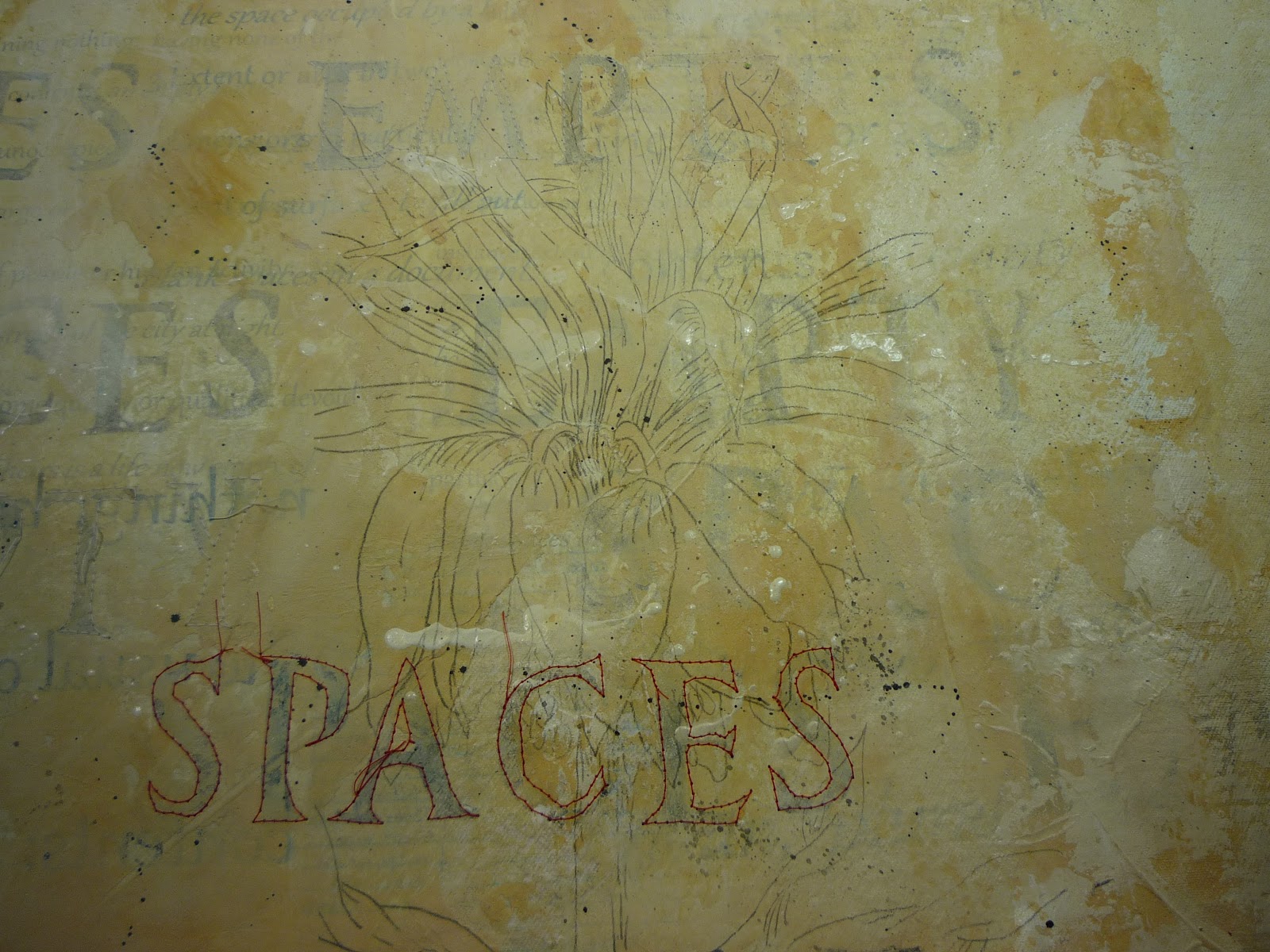
In my last entry, I wrote of stitching several of the phrases "empty spaces" in a cream colored thread, which would reward the viewer that takes a closer look.
I really love the additional texture that added to this canvas!


I finished up the piece by transferring the enlarged & cropped lily onto the canvas. I used a graphite transfer paper to trace parts of the drawing onto the canvas, freehand drawing the remainder (I had drawn the image several times already in my sketchbook so I was very familiar with the lines of it).


You will recall in my previous post that I wanted to add a touch of red into this piece.
As chance would have it the Lily Leaf Beetle (sometimes called the Scarlet Lilly Beetle) is a pest to the Crown Imperial Lily.

I practiced drawing the beetle in my sketchbook.


Sometimes things just work in your favor, don't they?

So I added three of the red beetles, munching on the plant as they leave their own empty spaces.


I wanted to have one of the "Empty Spaces" phrases more prominent so I stitched the chosen one in red. I used a very light application of watercolor paint inside the letters.


The last thing I did to finish this piece up was to stretch the canvas over stretcher bars. I had planned on this finishing technique from the beginning so I was very careful about where the lily and the phrase was placed.

One of my favorite things about this piece was how the layering all came together in the end. I have many layers of text, transfers, stamping, collage, paint, molding paste, machine stitching and drawing on top of this canvas. 


When you view the entire piece, you can see peeks of each layer.


"Empty Spaces- New Growth"


I hope that you all allow the empty spaces in your life to fill with new growth.

Thank you for following along with me as I created this artwork.


Monday, May 14, 2012

Finished but Nameless

 
Liz Kettle posting. My piece for the Empty Spaces theme is finished. I decided to mount it on a canvas because the two parts of the diptych are small and I was worried that they would be lost when hung directly on a wall. Plus, it was important for me to have the space around and between the two pieces to be white which you can't always count on in a gallery setting.


Hopefully you can see some of the stitching in this detail photo. The left side of the diptych is stitched along the black lines in cotton thread. The right side is stitched in the white spaces with silk and rayon threads. I hope this piece evokes the question of what is 'empty'.


I haven't decided on a name yet. Usually, when I hand stitch so much on a piece of art I have plenty of time to mull over a name but this time I didn't come up with one. I will have to make a list of ideas and see what resonates. Let me know what you think in the comments.

Thursday, May 10, 2012

The evolution of "Faith" - my empty spaces piece

Gloria Hansen here. In thinking about "empty spaces," my mind was jumping to many interpretations,  and I quickly realized it's a theme that we all can explore for a very long time. To quiet my jumping thoughts, I decided to keep it simple, keep it simple, keep it simple, and see what flows.  This is how my piece empty spaces piece evolved:

 I started with an empty box and added a red square.  Working digitally, I created a line of progressively larger dots. I envisioned french knots, with the larger knots having an extra wrap of thread.
In this version, I added lines of digital stitches.  Another way to think of it is a line with "empty spaces."

I added black to further break up the empty space, and added more lines of vertical digital stitches.

I turned off the digital layer with the stitches and started to experiment with the shape of the black rectangle.

I added perspective and then experimented again with digital stitches.
Still clueless as to what would evolve, those shapes immediately reminded me of a show I saw in London at the Museum of Design. There was an exhibit by John Pawson, an architect who is described as a "minimalist" and is known for his process of reduction and for creating designs of "simplicity, grace, and visual clarity." The image above on the left was central to the exhibit, a "site-specific 1:1 full-size installation." I'm standing within the room in the image on the right.  I and my business partner, Derry, who took me to the exhibit, spent a lot of time sitting on the bench and absorbing the incredible peaceful feel of the space. Although we were sitting in the middle of a busy museum, it felt more like we were sitting within a zen garden.

Also of interest, on the other side of the back wall are people looking at a different piece in the exhibit.  While anyone within the room could see those behind the room, those outside could not see in. More food for contemplation.

As I thought more about that exhibit, I started going through folders of photographs I'd taken around that time period. In the process, I started pulling out copies of ones I might want to work with. After weeding them down, I decided on two below to form the basis of my piece -- an open road that I took from the front passenger seat while traveling out west and a photo of a window from a decaying building in England.


I selected more photos with things that can move through space -- a bird, a sheep, a train, a flying machine, and I selected an escalator and a statute. The escalator was taken inside a science museum, and I loved the neon colors reflected on it. Two photos that comes up a lot in my personal work are a replica of daVinci's flying machine that was on display at the V&A Museum and a Paris-bound train with daVinci artwork on it (although I've added to the image above). The flying machine is in two pieces I've made: The Journey and Another Journey, and the train image is in a piece not on my website yet.

I opened all of the images in Photoshop and began working with them. Night after night, more nights after night, I worked on the design. Version after version, layer after layer.

This is one of the versions I came up with.

As you can see, the above has a lot of layers, groups, and groups within groups of layers going on. My next goal was turning off layers to see what I could remove. 

 
While experimenting with various versions, I added a black/white adjustment layer to remove color altogether. By dragging the color sliders, I experimented with the tonality of the image. Using a black/white adjustment layer is a better option than simply desaturating an image as you can control the value of the lightness and darkness of each color within your image. 

Because the size requirement is based on 8, I experimented with different scales on the elements within the design. 

While I like this, it seemed to also need some type of framework.


The above is the final piece called "Faith" which is left for you to interpret however you wish.  While the image is bordered in gray, I suspect there will be no binding or border on it, but rather a facing.  My intent is to print it on silk and hand stitch it.  Because I have several versions of it, in color and without, I also hope that it is the first in a series.

I often find the path to a new work is an interesting one, and I hope you've enjoyed the thinking behind this piece.


Friday, April 27, 2012

Empty Spaces - "What We Keep"

Jamie Fingal here. My piece is all about loss, and the things that we keep, to remind us who we are.  There is more in a previous post, and you can view it here.

The fabrics were Mistyfused to wool blended felt, free motion machine quilted, and a bit of hand sewing with #8 Perle cotton threads

A vintage zipper, and a photograph of scissors from my mother's sewing desk.  The photo has been transferred to fabric, with an ink jet copier.  The background of the scissors was painted to enhance the colors of the scissors.

Full view; with a photo transfer of my mom's cookbooks, apron, recipe holder, etc., on the upper left - scissors on the right.  Title:  "What We Keep: to remind ourselves who we are" by Jamie Fingal 2012  - 16" x 16"

Thursday, April 26, 2012

the empty space between

Sue B here...

In my last post here I talked about I had worked myself into a creative block over creating a piece for the "empty spaces" theme.   I really thought I was going to represent the theme with a vessel of some sort but I just couldn't seem to find the right shape for it.  It was after walking away from the project for a couple of weeks and coming back to it that the "aha" moment hit me and this piece came out of that moment:

 "empty spaces" 
hand painted silk, hand dyed black cotton, mounted on stretcher frame 12" x 24"

It's the empty spaces in this piece that create the imagery.  Without those empty spaces it would just be a solid piece of fabric.   Sometimes, in art, just like in life, it's the empty spaces that have the most impact.


"empty spaces" detail


Sunday, April 22, 2012

Listening To Myself


Liz here this beautiful Spring Sunday. I have been madly stitching away on my Empty Spaces piece and all the while questioning just what the heck I am doing! I am hand stitching white on white. Is that insane or what? Why am I compelled to do this intensive amount of stitching when it isn't even obvious unless you are looking closely at the piece?

I have to confess...this isn't the first time I have caught myself doing this sort of barely visible stitching by hand. Each time I ask myself why. Why is it important to me do this sort of stitching? Do you ever talk to your art in progress? I do. All the time. Not out loud of course! Well, actually, now that I think about it I do sometimes talk to myself and my art out loud.

Here are some examples of what I mean--of the stitching not the talking out loud:

 In this one I even used beads that blend!


This isn't new, I have been doing this for years. I just sort of went with what my intuition told me and while I wondered why I needed to do this I didn't think too much about it. Though I have to admit to telling myself I am stupid for working this laboriously on my pieces.

While working on this  Empty Spaces piece the last couple months I have been traveling a lot; away from home about as much as I was home. This crazy need to add so much hand stitching was on my mind a lot.  Why couldn't I just quickly machine stitch this and be done with it, I asked myself over and over. I have a deadline and I didn't really have time for all this hand stitching that is hardly visible!  Then, on one boring flight (can't remember which one) I was mulling this over when I remembered what my friend Terry White said about my work. She said that what she loved about my work was the details. All of a sudden I had this big thought shift! I realized that these details are my way of inviting the viewer to slow down and look closer. All of this stitching is my way of saying: stop, be here now, allow yourself a moment to be, think and simply breathe. Wow...my work was talking for me. My work is (hopefully) telling the viewer what I would tell them if I was standing there next to them.

Now, unfortunately, this piece has also told me that it isn't finished! It doesn't care about the deadline. It wants to be a diptych. I started out to make one small piece but it is insisting on including the questions I asked in my previous post; is empty space the positive or negative, the black or the white? And, of course it is insisting that a lot of hand stitching be included.  I could ignore it, call it done and spend the day reading outside but I would never feel right about the piece. As you can see in my sneak peek photo above that I have a bit of stitching in my immediate future.

Wednesday, April 18, 2012

Part Two

Carol here again.
Continuing the tale of my "Empty Spaces" piece.

I want to be completely honest here and say that this has not be an easy or free flowing piece of work.
Life interferes, my mood can change what is happening in my work and I'm not used to following a set theme when I create.
Having said all of that, I will say that my own misunderstanding of the deadline created some angst as well.
I thought that I had a month less than what I really had to complete the artwork.
It was great finishing it early but that extra month would have been nice!


I continued to build up the backgrounds with more transfers.
Using cheap foam stamps, I added a layer of text on top of this.

I used a fluid acrylic paint with mica pieces in it to give a little bit of shimmer.

I really liked the look of the larger letters but wanted them to fade into the background more.
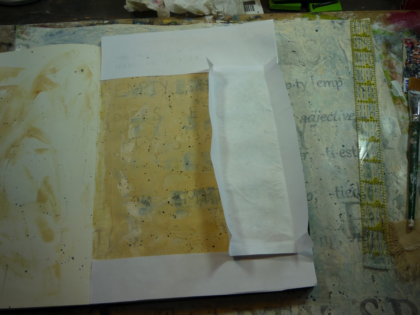
I wanted to introduce more texture at this point so I pulled out the sketchbook that I had been working in.
Here is one of the pages that I experimented on.


I liked that so I applied an irregular layer of modeling paste (or molding paste depending on the manufacturer) with a large palette knife.
You can see that I skipped areas - just here and there to add some texture.
I did a couple of layers of it - I added paint to the paste before I applied it to one canvas, the other one I painted  over the paste afterwards.

Notice how I have left an area around the outside of the canvas blank.
This area will be on the back of the piece after it is completed. 
I think that the paint color was raw sienna. The addition of the white molding paste did act to subdue the paint color somewhat but I liked it.
I started really getting into what was going on with the canvas piece at this point and just kept going with it.

I loaded a small brush with a lighter color and let my crazy side (what? you say...so you thought every side of me was crazy!) take over.
I spattered  small amounts of the (titan buff) paint as well as a little bit of black.


If you look closely you can see the lines from a transfer that I did
of one of my mom's journal pages.

I really liked the piece and was at the point that I feared screwing it up by doing anything else...but knew that it needed something else.
This was when I returned to the sketchbook to work out my plan.

I revisited my writings when I first began working on the theme -
"I began to think of other empty spaces.  Spaces that existed for another purpose.
Like in the garden. You dig a hole (a space that is now empty) to drop a seed into it.
Or maybe in the forest. A tree falls to the ground, rots and eventually leaves an empty space there. Yet, in that space, mushrooms begin to grow. Small plants sprout up.
The space is empty yet the death of one thing has provided a fertile space for another.

Life finds a way to fill that empty space."


With that fresh in my mind, I began looking at the canvas as the empty space that was acting as fodder for my emotions, a space holder if you will...and allowing it to symbolically be a fertile ground for the growth of something else. My negative emotions were decaying, they were becoming fertilizer to this ground.
I felt that I needed to see new growth in this space.


I had a drawing that I had done of a flower with it's roots growing down, strong and bold. I wanted to try it out but not on the canvas that I liked.
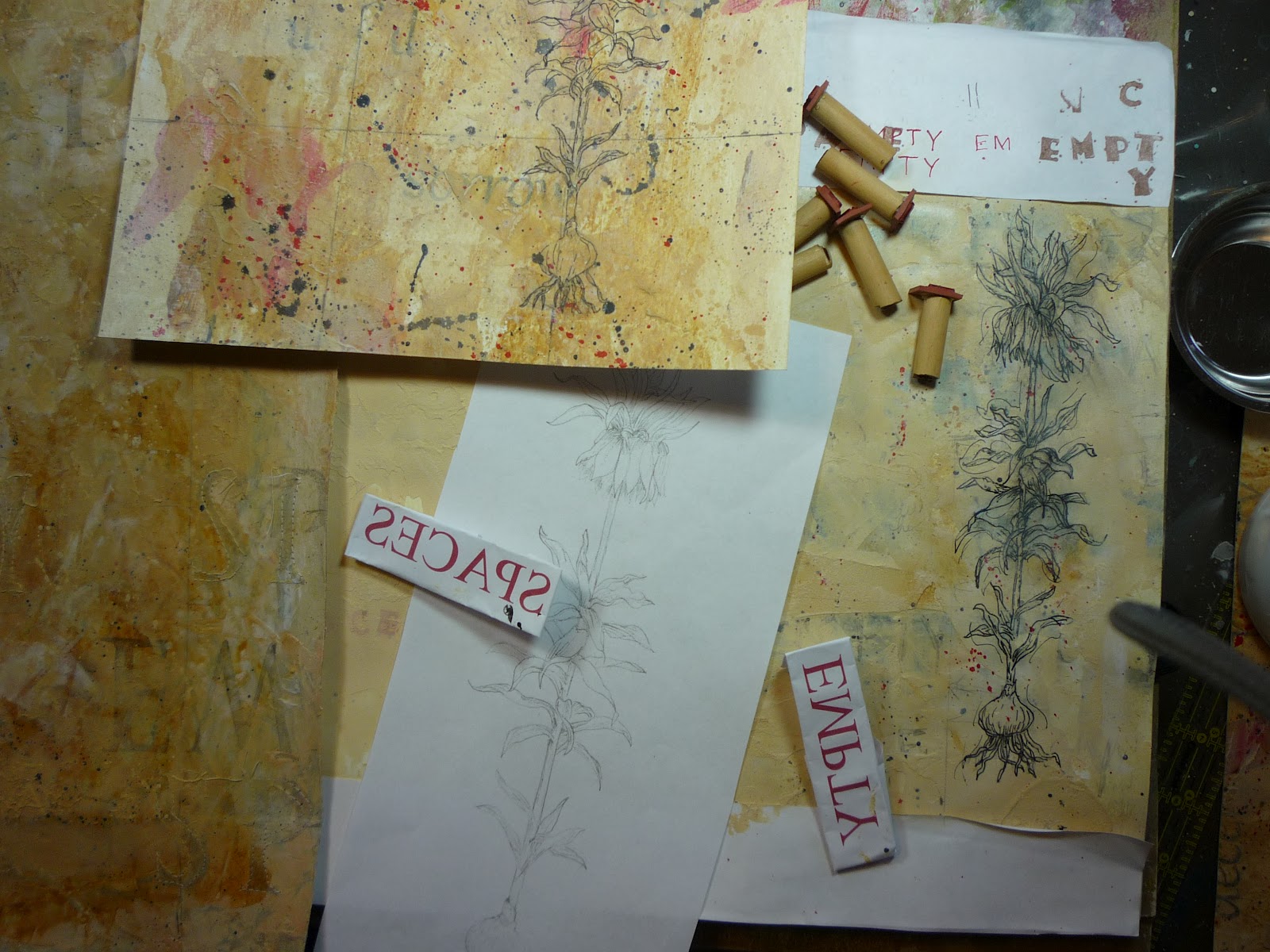
I created a mock piece in my sketchbook, scanned the drawing, printed it out and used it as a transfer on the page.
The drawing was rather detailed and I didn't want to take the time to draw it again but needed a fair representation of it. A transfer was the quickest way to do this.


You can see the second piece that I started under the sketchbook.
I had done a couple of paint washes over the surface trying out different colors.


I often, quite often actually, get into working things in my sketchbook so much that I go overboard with the details of it all...
and that is exactly what happened here. 
I was having so much fun drawing, stamping and painting that I totally allowed it to take me away from working on the actual piece of artwork!


The sketchbook was becoming the artwork.
I had to step away from it.


It was a good thing that I did this work in my sketchbook because I realized that the full drawing of the plant was too much - it was too small, too detailed for that size of canvas.
I decided to use a portion of the drawing but modify the size a bit.
Using the scan from the original drawing, I enlarged it so that about a third of it would fit on the 16 inch square canvas.

I cut the flower out to get a better idea about the size.


I liked the size as it (roughly) divided the size of the piece into thirds.

There were two other things that I had in mind for this piece:
adding machine stitching
adding a touch of red (for a tan, black and red color scheme).

So it was back to the samples for me.

Here is a practice stitching (complete with one backwards letter!).


Long story even longer, I loved the addition of the stitching so much that I stitched several of the stamped text blocks with a light colored thread. This will reward the viewer that takes a closer look at the piece.
This brings us to the last phase of the creation of this piece of artwork.

I'll give my cohorts a chance to talk before I finish up with mine.

I hope that you all are living your life as creatively as you can.
As women, who tend to give and give and give, we need the outlet that creativity can offer us.
We need to be able to give some energy over to what is fun, what is joyful to us.
And that is what creating art is to me.
It sustains me.
It lets me put all of the stress of the day on the shelf for a bit and allow my passion to take over.

Are you honoring your creativity?